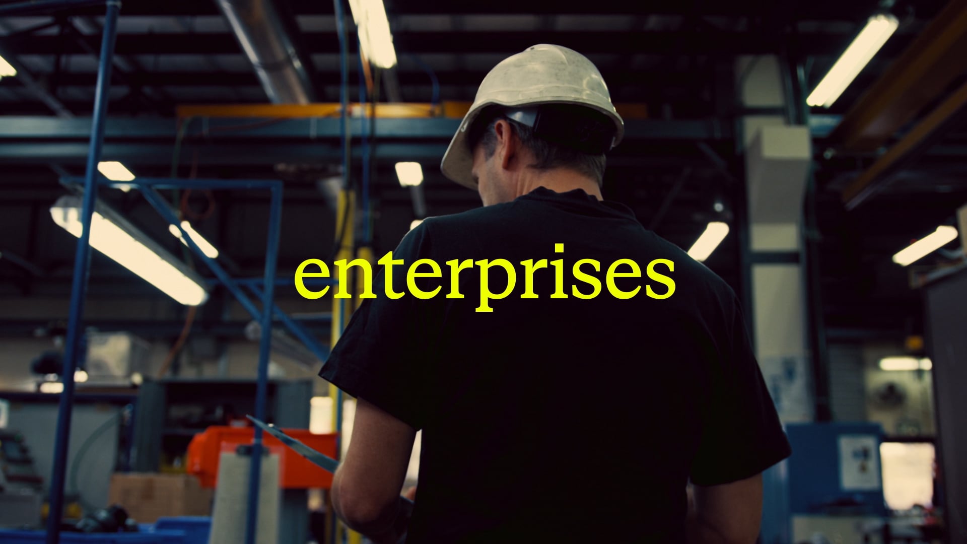
Engineering the adaptive enterprise
Everforth’s new brand identity marks a significant evolution for ASGN, a digital innovation company known for bringing transformative technology, engineering, and expertise to other businesses at scale. We were tapped by the strategic consultants at Brand Federation as design partner to guide ASGN’s visual rebrand from a portfolio of companies towards its vision of one unified brand, bringing their full offering to every client engagement.
Built for what’s next
ASGN needed a bold and confident identity to usher in a new era, strategically positioning them between niche and big competitors as the agile partner, able to scale emerging solutions at the speed of change. Building off of Brand Federation’s research, strategy, and positioning, we consulted on naming and brand architecture to visualize brand worlds and guide decision-making on the name and the ultimate visual identity direction.
Before
After
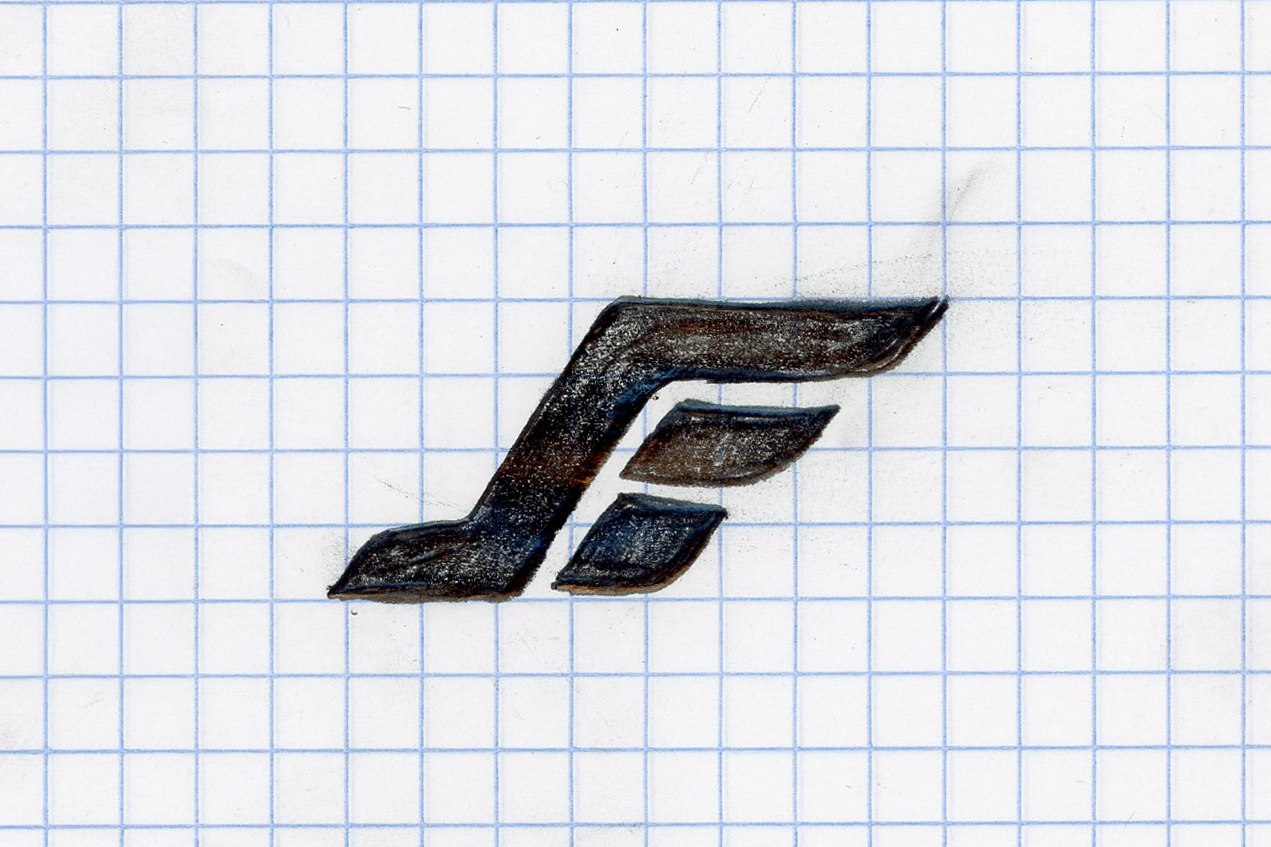
Agility, precision, and power
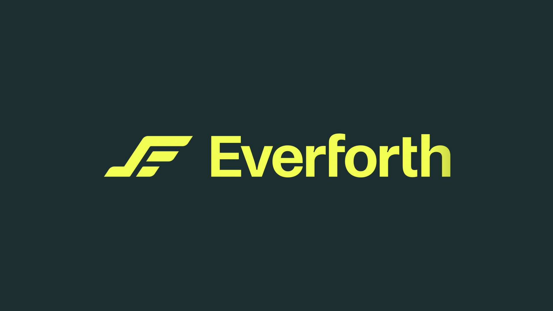
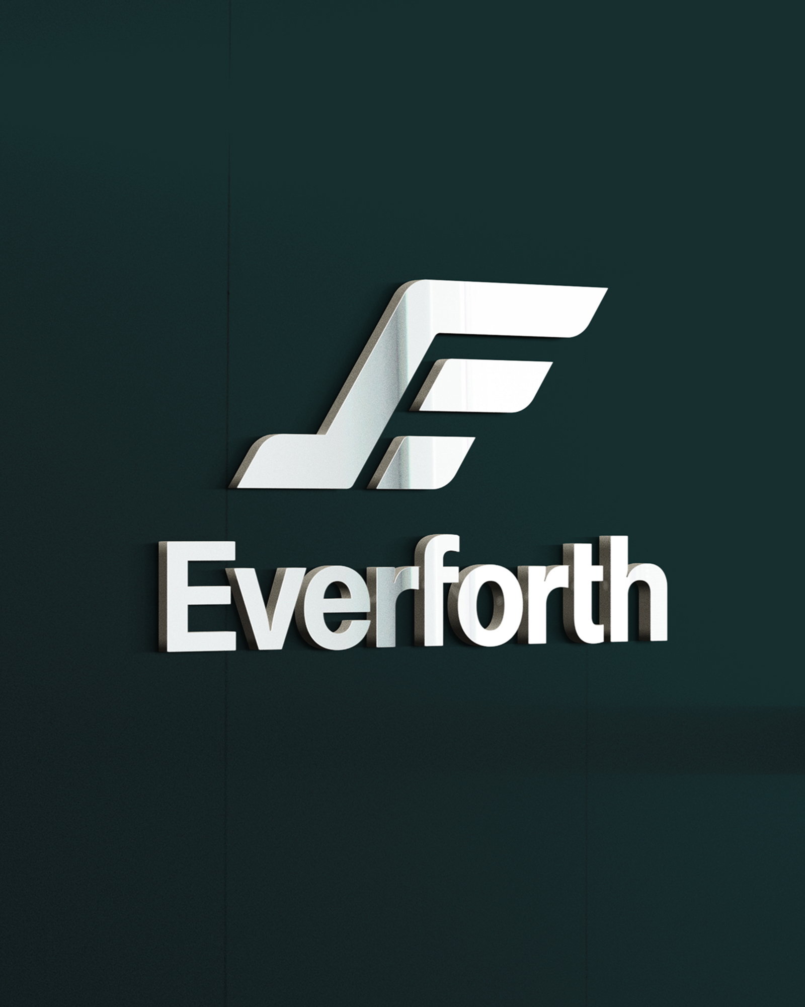
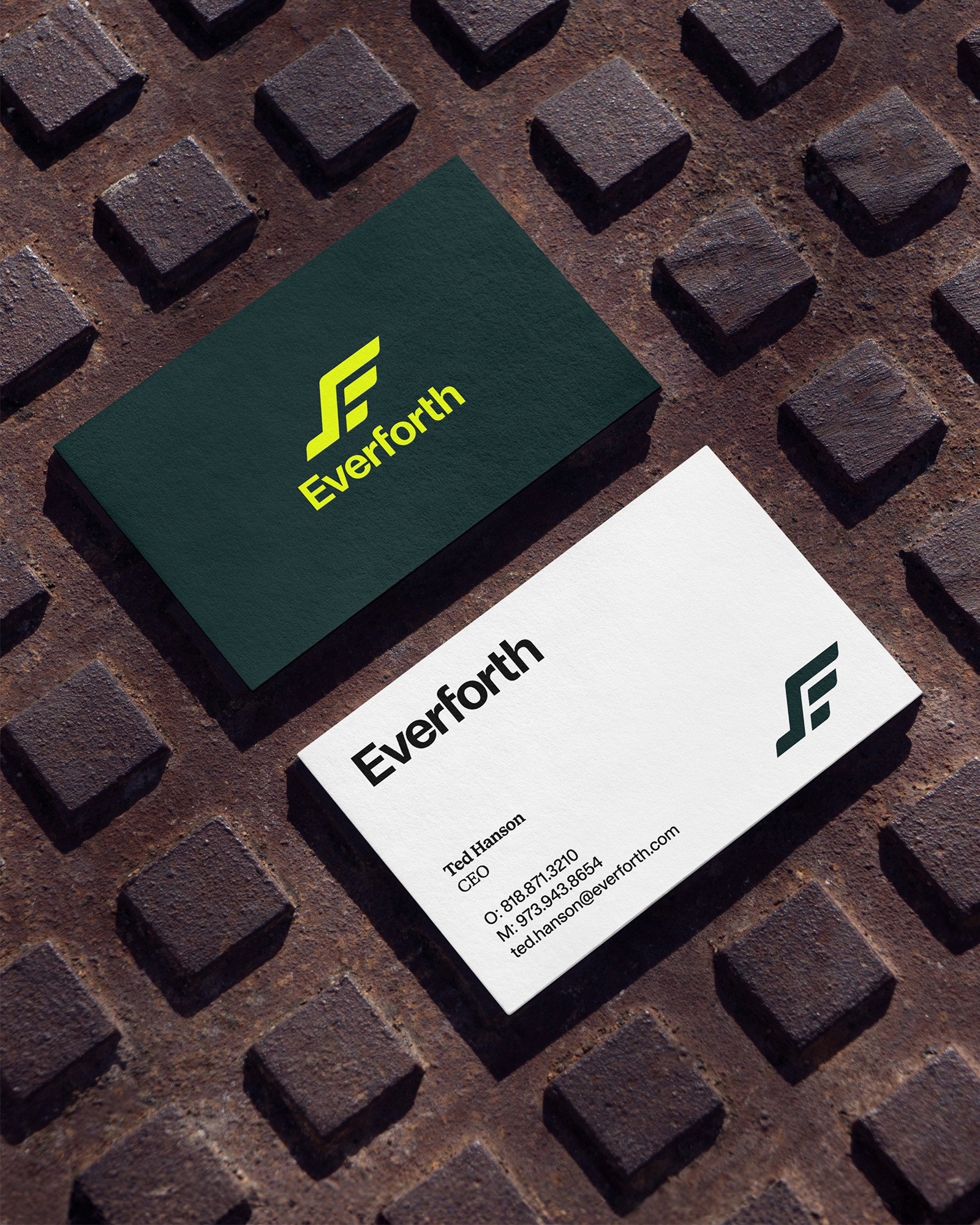
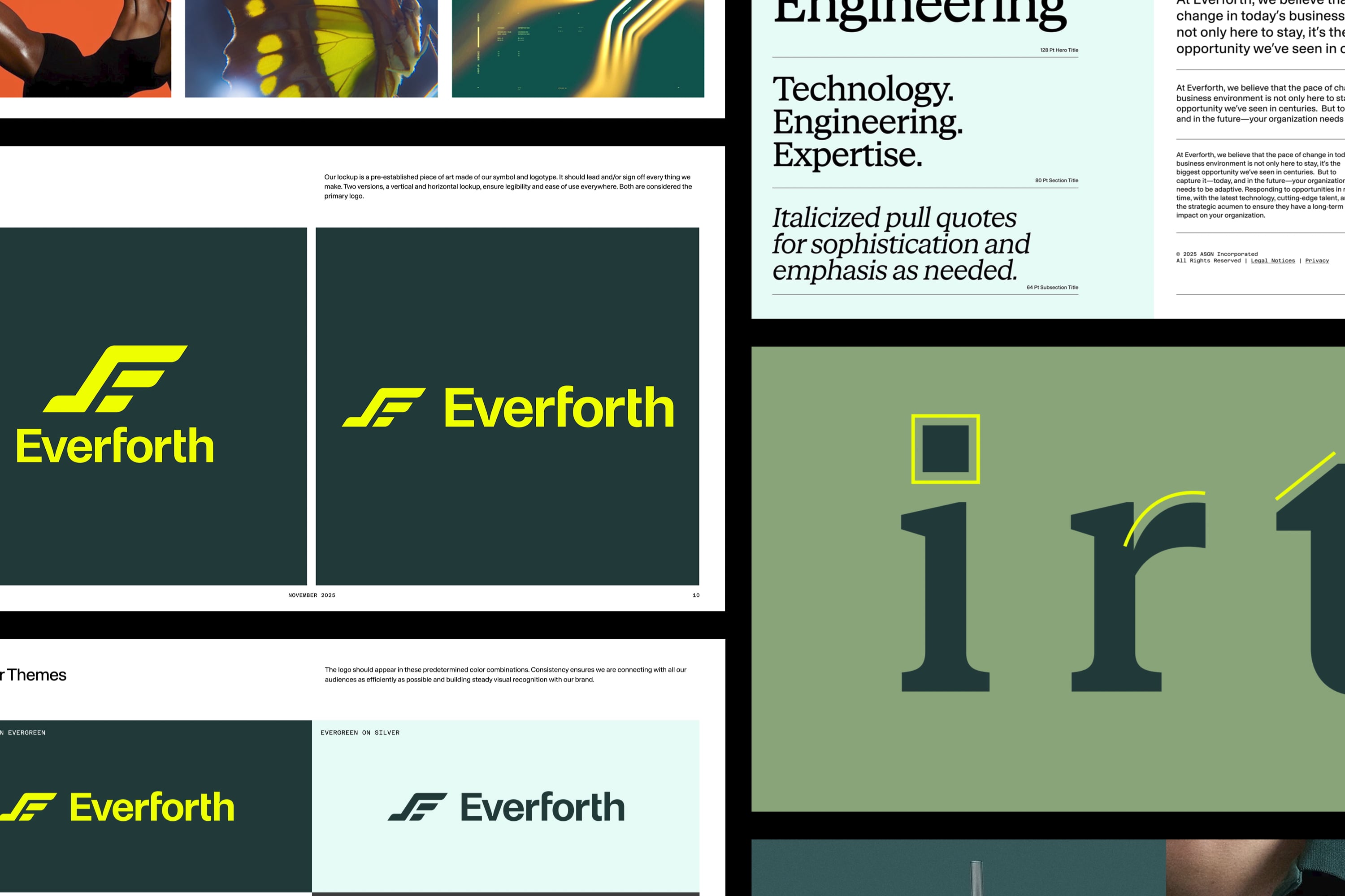
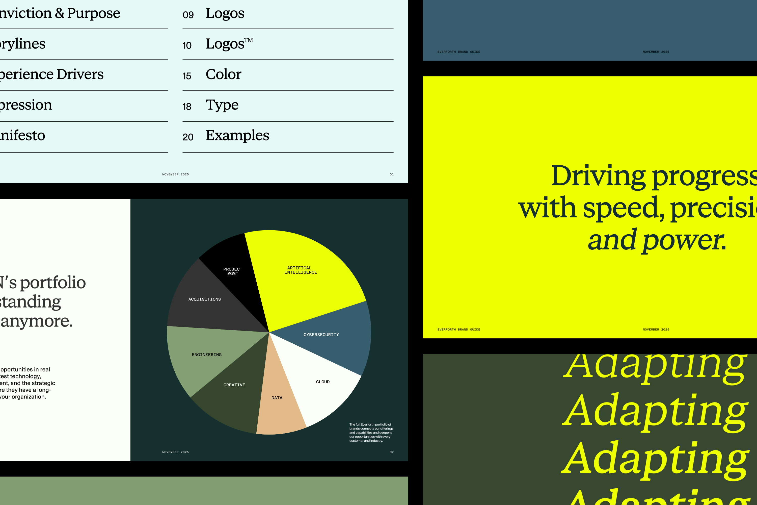
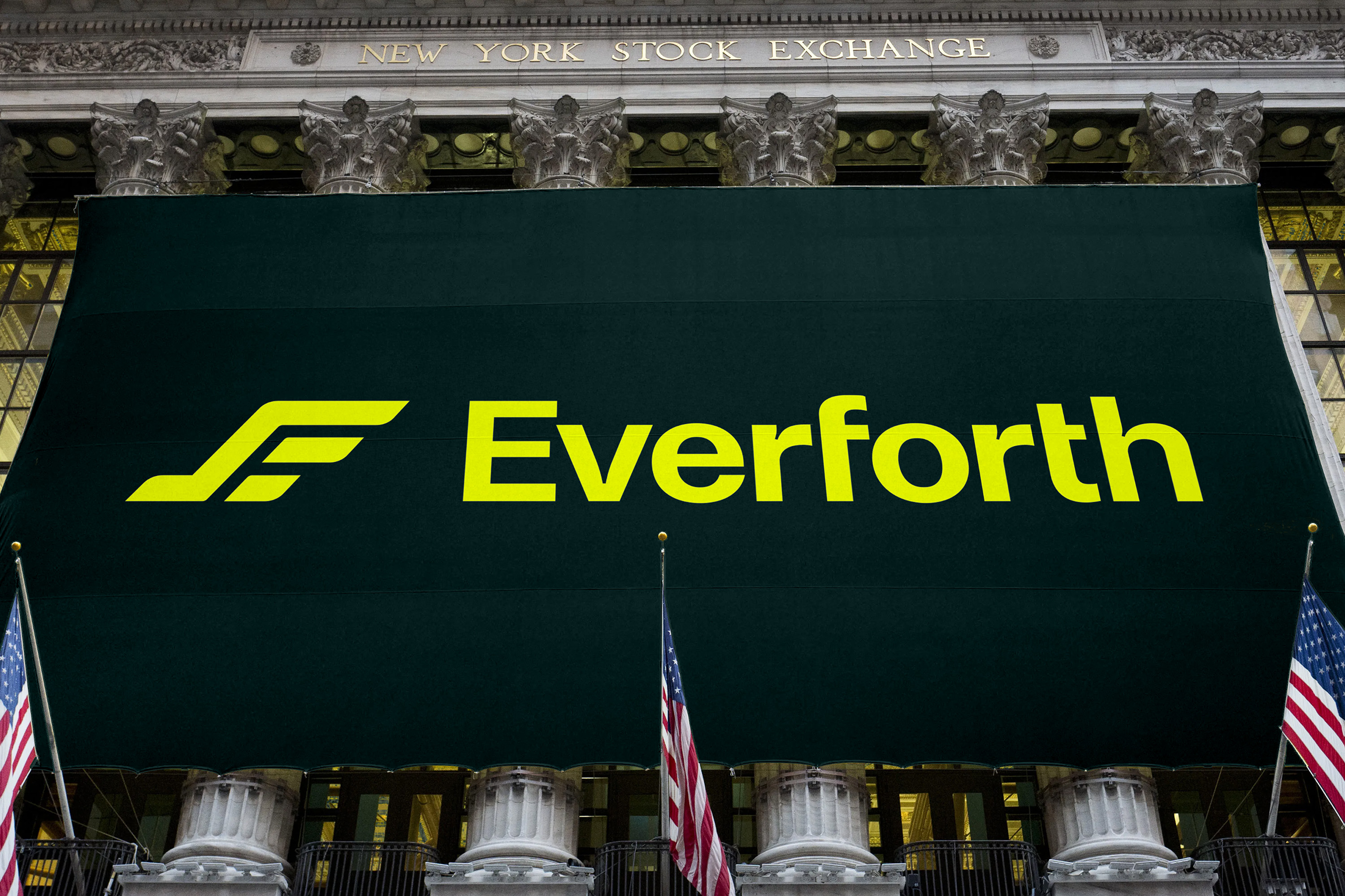
Everforth’s signature mark is the wing, taking adaptive inspiration from the natural and human worlds to evoke agility and confidence. An organic symbol translated through the engineered horizontal geometry of the letterforms, the phonetic two-parter of “E” and “F” characters emerge in the positive and negative space. Electric lemon highlights and sharp contrasting forms punctuate the rich, earthy color palette and earnest serif headline typography to deepen this contrast of organic and engineered detail.

Distilling the brand essence of a global technology business down to a single logo and identity system is a daunting task. Selman successfully brought the new company name and brand positioning to life in a graphic identity that was incredibly well received by both employees and customers.”

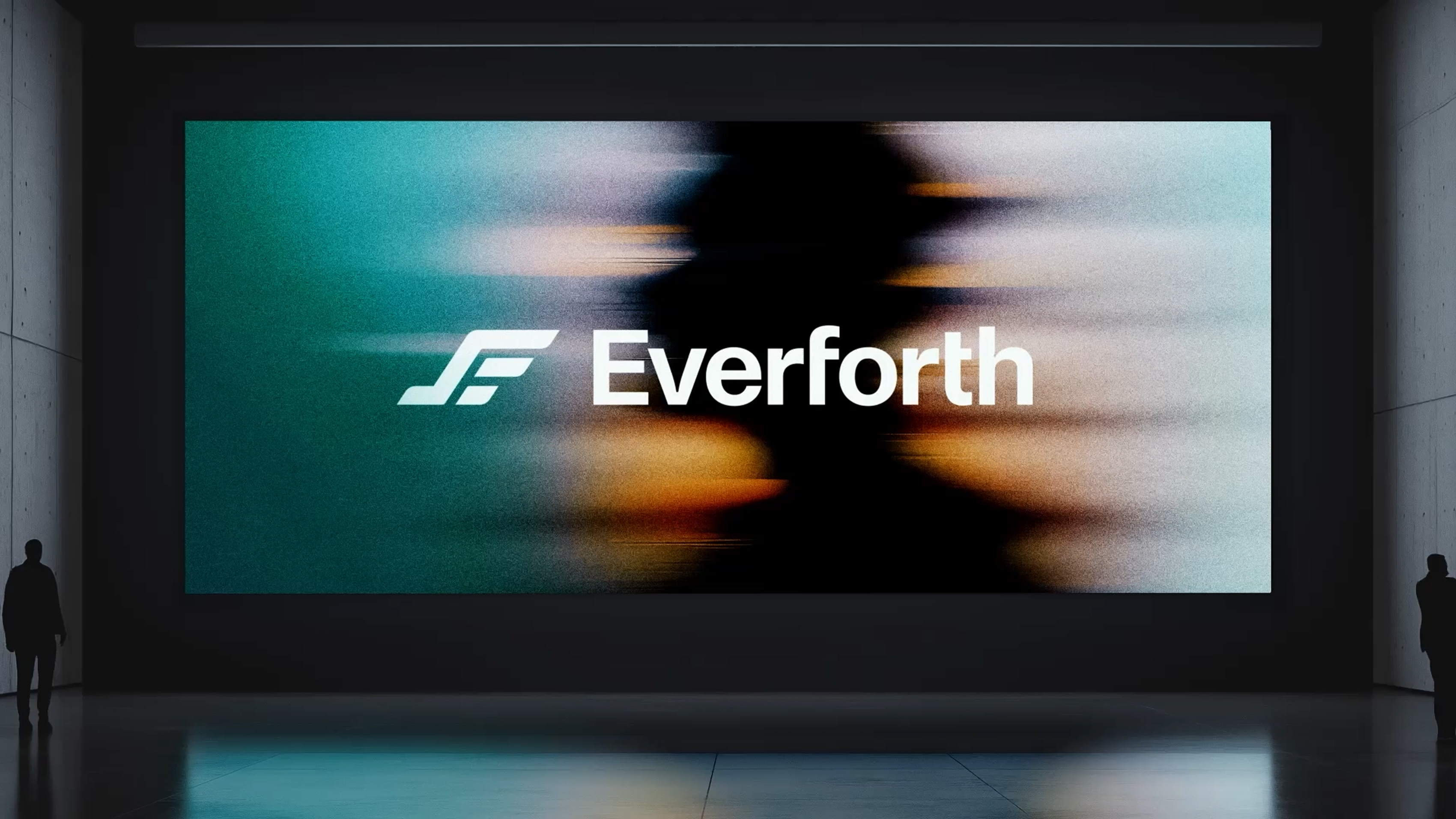
Countdown to launch
Everforth debuted the rebrand on Investor Day, November 20th, 2025. The event marked the first public reveal of ASGN’s transformation to integrate its portfolio of companies at every step as one cohesive branded house.


Selman Team
Amely Richter
Chris Schroeder
Courtney Ewan
Hanjoon Kim
Johnny Selman
Jordan Tran
JP Chirdon
Client Team
Ted Hanson
Shiv Iyer
Rand Blazer
Kimberly Esterkin
Katherine Forbes
Shab Nassirpour
Jacob Elliott
Brand Federation
Asheley Jewett
Chelsea Glowacki
Kelly O'Keefe
Matt Williams